While you are remembering your childhood, we are sure that the color of your favorite toy or the color of the jersey of your favorite sports team will come to your mind, among other things. These associations are not a coincidence. Scientific research proves that colors evoke memories, make you feel as in the moment you evoked, and even give your body a feeling of the same temperature as it was in the moments you remember. The power of color Colors have the power to take you back to the past and awaken your feelings. They can inspire you to meet some new worlds. We reveal to you how the perception of colors has changed over time and which key values have remained deeply rooted in their symbolism. “Colorful” science First of all, it is important to know that colors have inspired many scientists, composers, and even entrepreneurs of the past to conduct research, make theories, and provide their visions of what colors are and what they mean to the world. When reading our blog, maybe the colors will motivate you to share some of your observations with us.
Isaac Newton was one of the first researchers to add color to his experiments. Using a prism and playing with light, he projected a rainbow spectrum that he later developed into the famous colorful wheel. His belief is based on the postulate that colors are a perfect combination of light and darkness.
On the other hand, Johann Wolfgang Goethe loudly opposed Newton’s theory. He gave a note of individuality to this scientifically supported belief and emphasized that colors are not just a scientific measurement, but a personal experience. Goethe’s starting point, which is the first systematic research on colors that includes the psychological side, was recognized by most artists at the time.
In 1985, a new starting point was born, which permeated the elements of Newton’s and Goethe’s observations. Entrepreneur Smithsonian, a maker of wax and watercolors, compared their sensitivity to learning music. He created his own wheel of colors that overlapped at speed before the eye could even register.  Boundless inspiration Whether your beliefs are more in favor of the first or the second side, one thing is indisputable – colors are the energy that drives. They used to denote status in society (for example: white, black and red were worn only by wealthy sections of the population); they brought certain symbolism even in war (white flag as a symbol of peace); to famous designers they first appeared as visions; and for us as a motivation to find solutions to all the challenges that interior design brings.
Bekament INTERIOR
The colors encouraged us to create the BEKAMENT INTERIOR product range, to offer an irreplaceable solution for walls, to inspire life. INTERIOR is a comprehensive system solution containing products for all phases of interior wall treatment: from products for wall preparation for rendering, cement-lime mortar, high-quality leveling compounds (smoothing compound) to interior paints, and makes your space a comfortable place to stay. We believe that the interesting things we are writing about today will change your perception of colors or strengthen the experience you already have. Blue
green,
Pink, yellow or purple - click on your favorite color and immediately find out interesting information about it that you may not have known.
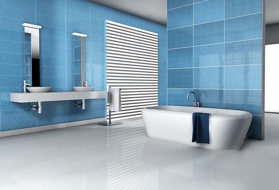
BLUE – A COLOR THAT WRITES HISTORY
If these days you are thinking of enriching your living space with one of the shades of blue, we believe that the following interesting facts will help you in your decision and encourage you to enrich your home with the shades of history. Moments of ancient times The first drawings in caves carry true significance in the evolution of mankind. The assumptions you have about the colors that first appeared in these drawings are probably correct. However, did you know that right after red, brown and black, they were adorned with blue? By adding blue to the interior design, in this context, you will give your space an artistic impression. Awaken productivity If you wish to make some change in the working space or office, by choosing the light blue color of the walls, you can get an effect that evokes respect and appreciation by your visitors. This thinking dates back to the 12th century and is hidden in the representation of the Virgin Mary. Her depiction is painted in light blue robe, which completely changed the perception of this color among most religious admirers of that time. Since then, it is believed that blue is the color of respect.
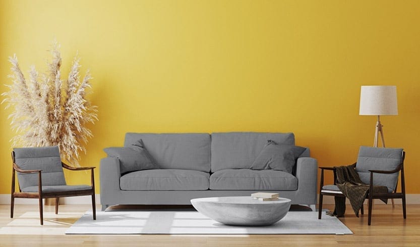
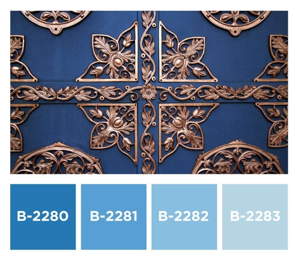 Harmonija energije i mira Harmony of energy and peace However, if the energy that certain colors carry and the harmony that is achieved with them is the most important thing when decorating your interior – you can consider the Feng Shui method of decorating your home. The first element according to this belief is water, and its carrier – blue – is a combination of fresh energy, purity and peace. It symbolizes family harmony and good interpersonal relations between the family, so it is suitable to enrich the walls of common rooms (like a living room) with it.
However, be careful when it comes to using dark blue paint for walls in a space where you do not have adequate mosquito protection. Namely, it has been scientifically proven that these insects have a very subtle visual experience, and that dark shades are attractive to them, especially during the late afternoon. If you add a source of artificial light, you create a pleasant environment for them to stay.
GREEN – SYNERGY OF NATURE AND PROSPERITY
You can view the historical review of this shade as a winning turn in favor of green over prejudices that were originally rooted. Initially considered unreliable and an association with betrayal, this color experienced its triumph when the world turned again to nature and the celebration of its gifts. Triumph over history The question is, where is the thread between this nuance and betrayal? Just as the meaning of blue changed in accordance with religious beliefs, so green was a symbol of Judas – or vice versa. During the Middle Ages, the personification of Judas was represented in robes of this color, but it was not only the medieval creators of frescoes who were responsible for the infamous epithets given to green. Also, in the same period of time, the trade in paint was of a restrictive scope, which means that the painters did not have a permit to sell all colors, while, on the other hand, they were prohibited from combining them. Thus, professional painters had the opportunity to sell red, but not green. Painting in this shade was difficult and unpredictable because the green colors obtained from the plants were not permanent and faded quickly. Prosperity and development Precisely because of the challenging history, we encourage you to give a chance to this color which, according to Feng Shui, is adorned with very good vibes. There are beliefs that green color on the walls brings positive energy and health, and it is also connected with personal and financial development.
We recommend that this shade be your choice for the office. If you are at the beginning of your career and it is important for you to lay a healthy and solid foundation, choosing the green color of the space will attract business progress. Combining with brown shades, wooden furniture and natural metals will bring complete harmony. Relaxation and enjoyment When visiting a spa, the relaxing impression you gained was certainly influenced by the visual experience, primarily presented through the bamboo green color for the walls, which is often a mandatory element of any space for relaxation. If you are planning to give your bathroom a new look and a touch of serenity, the advice is to match this shade of green with white, gray or brown and thus create a space in which you will be happy to stay. 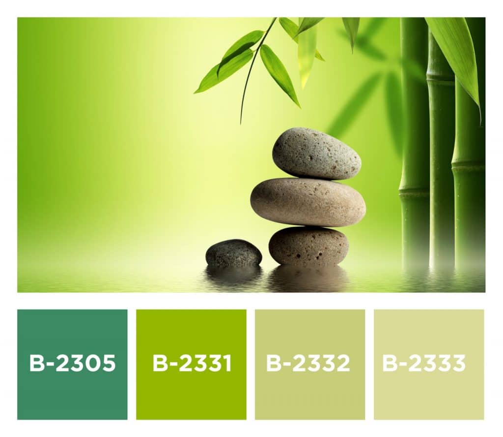
PINK – A SYMBOL OF TRANSITION
Through our blogs we try to present interesting facts about colors. After blue and green, we continue with the story, this time about pink. The reversals are pink Pink as a term in the English dictionary appeared back in 1600 as a verb with the meaning “decorate according to a pattern”. Hence the famous zigzag scissors enriched with the adjective “pink”. When it comes to the fashion industry, the pink became a trend a century later, and was only available to nobles and the upper class because of the symbolism of the luxury it wears.
Elvis Presley and Marilyn Monroe, with their controversial performances, revived it in the fifties and put its meaning in the context of provocation.
After that, it was concluded that the symbolism of pink lies in serenity and calm energy. Inspired by that, one of the football coaches in 1980 painted the walls of the locker room of the rival club in that color, with the goal of calming their heartbeat, that is, slowing down their motivation to play. Although he achieved the desired effect, the coach was punished for disobeying the law. If you have concluded that the history of pink is accompanied by frequent changes, you are right!
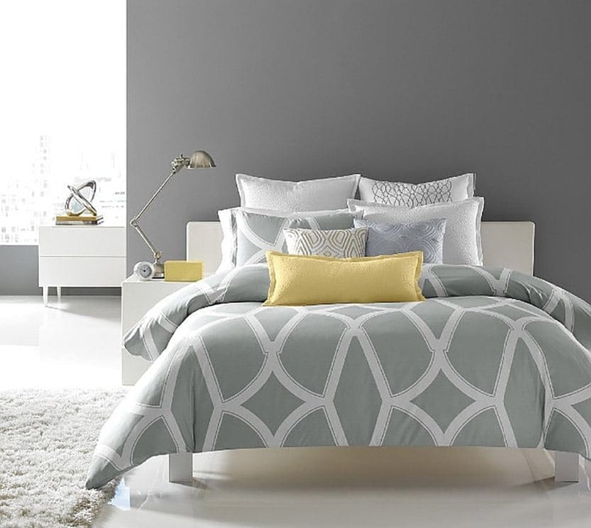
Carefree sleep and smiling mornings Today, it is a symbol of transition and progress, and the space painted with these shades gives your place of stay a pleasant tone, caring atmosphere and awakens a sense of empathy. 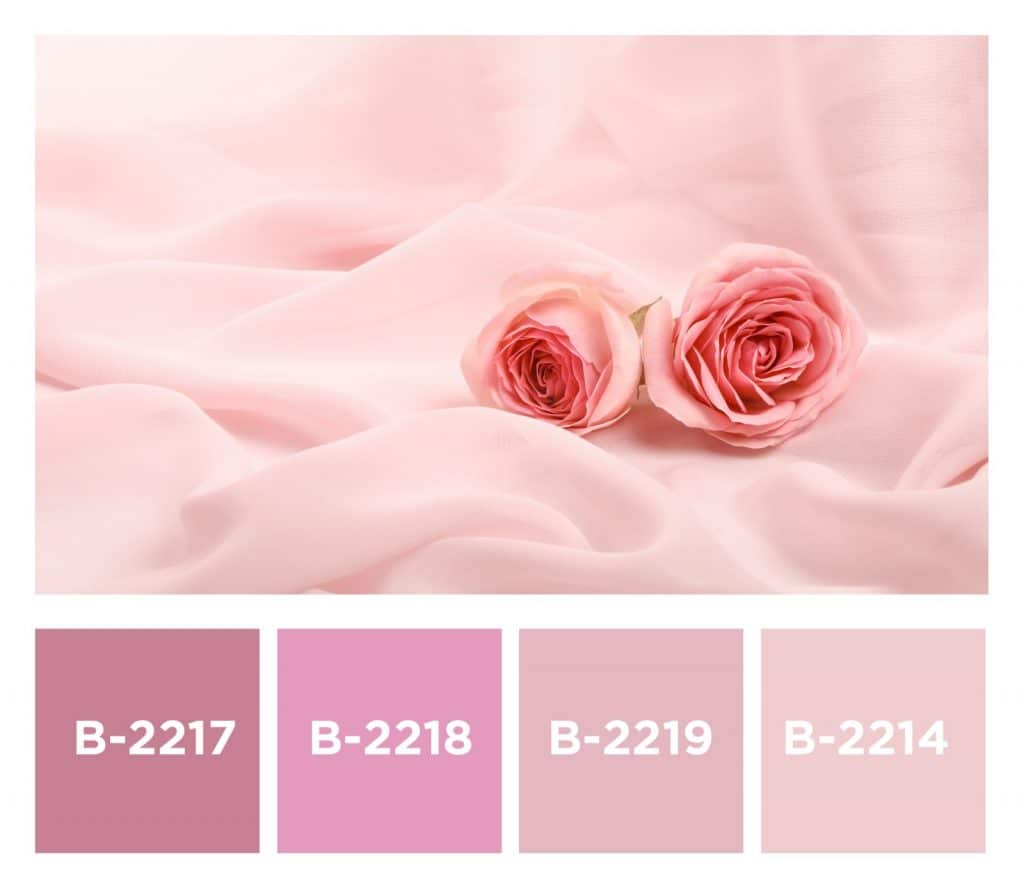 Since the bedroom should be an environment in which we can carefree relax and be happy to wake up, pink is an ideal choice for achieving this harmony. Explore one of its softer, warmer shades and complete the comfort of the ambience through a combination with earth tones.
YELLOW – PIGMENT OF ANCIENT TIMES
The history of yellow is about 17,000 years long and takes us back to the time of ancient Egypt and Rome. It is associated with the sun gods, but it has also woven the symbolism of faith and hope, which it also carries, into Christianity. And why is that? The color of inspiration This shade, like the sun, radiates positive vibrations and happiness, encourages enthusiasm and creativity. Painters like Van Gogh and Picasso found inspiration in it, and it suited them perfectly as a contrast to other, at that time more represented colors (like blue).
From the aspect of psychology, it carries the metaphor of awakening, encourages communication and interaction, and evokes optimistic thoughts about the future.
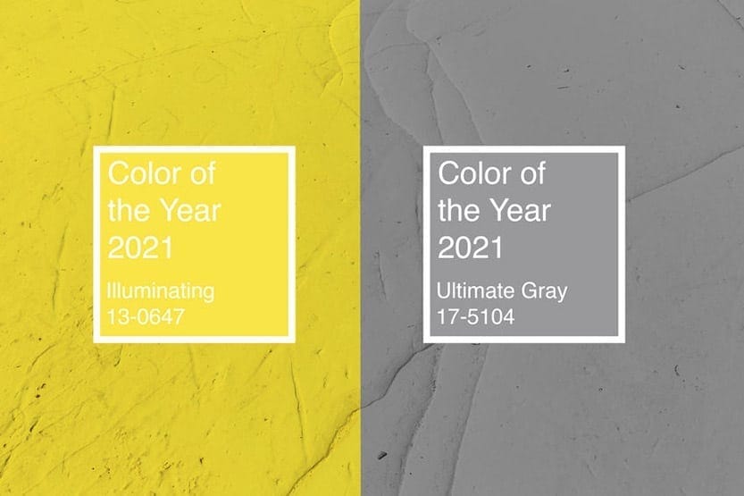
It deservedly took its place among the trending colors for 2021. Read more about it in our previous blog – What wall colors are trending? The warmth of the sun If you are planning to awaken the warm atmosphere in your home this spring, we encourage you to do it in a yellow shade – just as the sun wakes up in its tones every morning. According to the Feng Shui method of interior design, it is associated with stability and protection, and encourages inner peace. 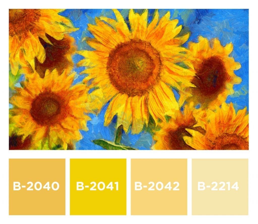 The color of action and interaction will deepen conversations, give birth to new creative ideas, and at the same time create a balance between strong energy and peace.
We advise you to complete its effect with gray and white – if you are more of a fan of Scandinavian style, and complementary purple – if you are moved by art.
PURPLE – A SYMBOL OF LUXURY
The purple color was created in the Phoenician capital, that is, on the territory of today’s Lebanon. Created only for nobles, it bore the symbolism of luxury and prestige, and officially Queen Elizabeth prescribed a law prohibiting the use of this shade to those who do not belong to a higher class.
Over time, the law became more flexible, and the recognizability of the color was influenced by the event from 1856, when a young English chemist created a purple color trying to discover a cure for malaria. Although it also found its purpose in art (Gustav Clint preferred a combination of this and brown shades), purple remained a metaphor for power. Today, politicians on a global level often wear a purple tie which represents a symbiosis of assertiveness brought by red and compassion symbolized by blue. A touch of mystery Just as it is necessary to choose only a detail in this color in fashion, so it is recommended that, when decorating the interior, this shade is dosed with other, light and cool tones. The right measure of applying this color will make the space precious – just like rejoicing in the rare violets that you can find in the yard in early spring. 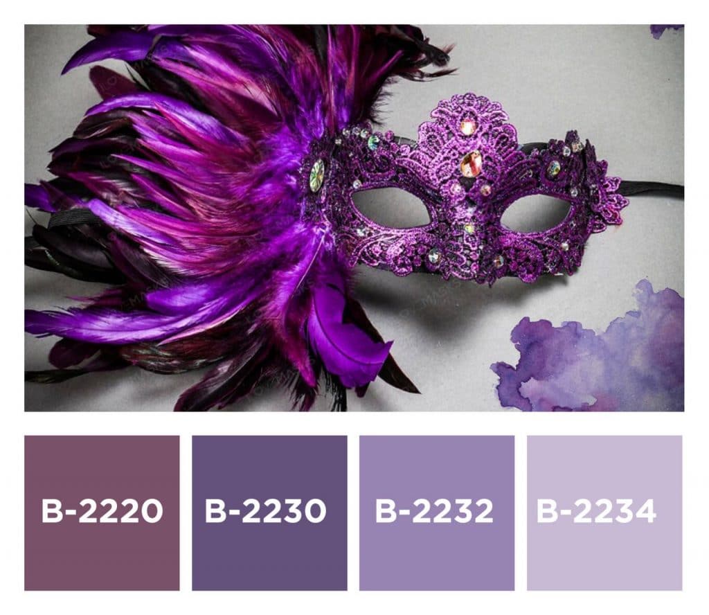
AND FINALLY....
We hope that the information we shared with you today helped you choose the color for the walls. Usually, the subjective feeling is the right one, although sometimes you yourself are not sure how to express it. That is why we try to motivate you by sharing with you scientific facts, historical data and expert opinions.. 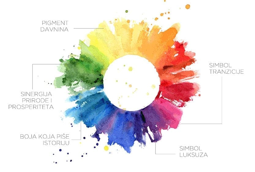 If we have encouraged you to take the path of change this spring, take a look BECAMENT COLOR CHART and before going to the point of sale, choose one of the desired shades. You will have the opportunity to, with the help of an expert at the point of sale and BEKAMENT MIX SYSTEM, get exactly the shade you like best.
f you want to know which wall colors are trending this year see our blog “What wall colors are trending?”
Join us on social media Facebook / Instagram and share with us some of the interesting things you know about colors.
Did you like this text? Share it with your friends.


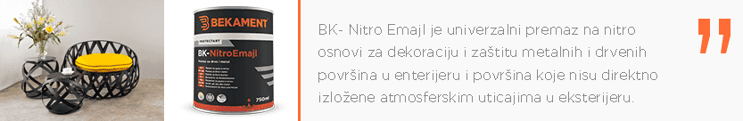
 Garden furniture and other pieces of furniture outdoors are constantly exposed to various weather conditions such as sunlight, rain or snow, and it is necessary to take certain measures to protect them and restore their original appearance. The best way to “breathe life” into them is to use oil and nitro-based PROTECTART coatings for decoration and protection of metals and wood in the interior and exterior (joinery, fences, gates, metal structures).
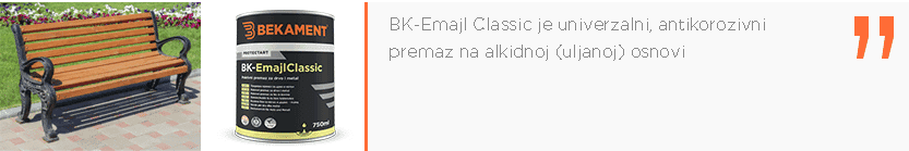
 If you are a fan of sailing on sunny days, it is necessary to take adequate care of your boat and prepare it for the warm season. We suggest you BK-Marine, a colorless high-gloss coating, designed to protect boats, ship floors and other woodwork in the interior and exterior. It is resistant to water, mechanical and atmospheric influences.
  In addition to coatings for universal protection of metal and wood surfaces, PROTECTART also offers a coating for decorative protection of radiators and similar metal heating surfaces that can become a beautiful decoration of your interior. The coatings are resistant to wear and temperatures up to 120°C.
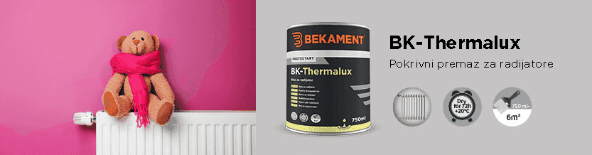
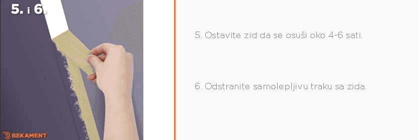
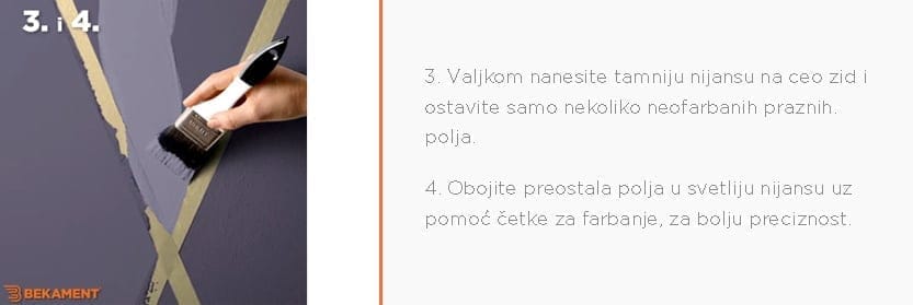
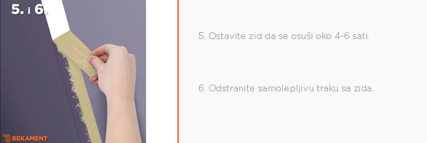
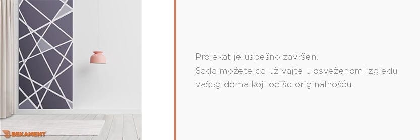
 Once you have all the necessary materials and tools, you can start realizing your idea.
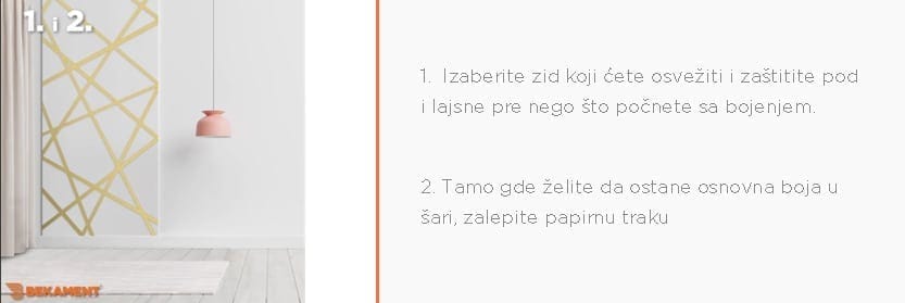
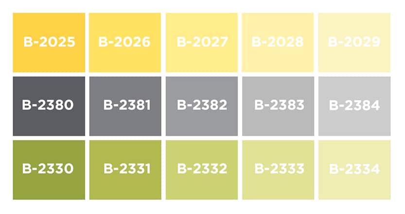 Note: The image only shows a clip of over 3000 available shades from the Bekament interior color palette
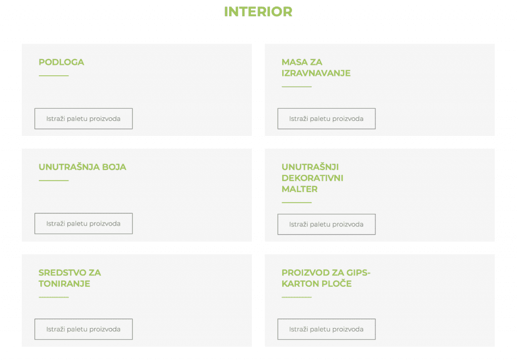
 Izvor: decoist.com Regardless of whether you decide to follow the trends of world-renowned institutes or to be completely free and independent in your wall color choices, we are here to remind you that the power is in our hands. We hope that we have INSPIRED you to make changes this spring and choose a color for the walls in accordance with your mood, character, and trends; We ENCOURAGE you to try something completely new and thus sail into the world of creativity and imagination; We MOTIVATE you to find a way to always feel comfortable in your space and we EMPOWER you to implement the changes you envision just as you envisioned. Watch the video on our